Friday, September 2, 2011

Lab 5


The results of Spline and Kriging interpolation provide similar generally identified areas of high and low precipitation. In the analysis of total precipitation both methods indicate the northern area of LA County as having the lowest precipitation and a precipitation high in the mid-eastern region of the county. These same commonalities hold true for both interpolations of normal precipitation, though at initial inspection the image of the normal precipitation using Kriging looks much more similar to the total precipitation than the images for Spline interpolation. The results for analyzing the difference between normal and total also produce similar geographic distributions for Kriging compared to Spline.

From both results it is possible to conclude that this year’s precipitation is significantly above average for the county, though some small pockets of the county have experience slightly less precipitation than normal. Additionally, the regions with the largest differences in precipitation are also the areas normally experience high rainfall, and this year they have experienced the largest accumulated rainfall as well. It is also interesting to note that the middle area of the county regularly experiences this higher level of precipitation and is surround to the south, and especially the north, by regions of much lower precipitation.

One important distinction in the conclusion above is to what degree do the regions vary? This is dependent on the type of interpolation. As mentioned, they both display similar geographical patterns, however they present very different numeric scenarios. The Spline interpolation provides a much larger range of precipitation values, and also a much greater difference between the normal and total precipitation. The Kriging interpolation, however, presents a much smaller range of values that are essentially the median values of the Spline interpolation, with a larger minimum and a smaller maximum. The Kriging interpolation also presents a difference in precipitation that is about half of what the Spline interpolation provides. The reasoning for this is because the Kriging method generates a smoother result, and uses inexact method, meaning it is not bound to incorporate the exact values at the station locations. This creates a more average result, with fewer outliers and thus less difference between the normal and total precipitation. I believe, however, that despite the advantages of this more generalized approach, especially given the relatively small geographical area, the Spline interpolation is better for this data set as it is able to better identify the important detailed geographical variation that may occur in a region alternating between mountains and valleys, as demonstrated by the numerical range of the data, that wouldn’t necessarily be as visible with a Kriging interpolation.
Wednesday, August 31, 2011

Quiz 2

PART 1
1.) The 10 most populous countries in descending order:
1.China
2.India
3.United States
4.Indonesia
5.Russia
6.Brazil
7.Pakistan
8.Japan
9.Bangladesh
10.Nigeria

I found this by opening the country attribute table and then sorting the data by POP_CNTRY field to list the greatest population values first.

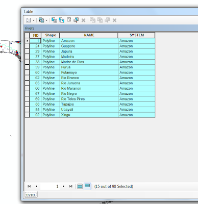
2.) There are 15 rivers that are part of the Amazon river system. I found this by using the select by attribute feature, and choose selected all rivers where 'system' = 'amazon'.

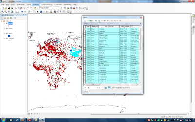
3.) There are 60 cities within 500 km of the Amu Darya and Syr Darya rivers.
To do this I first used select by attribute to select the two desired rivers. I then used select by location to select cities as the target layer and the selected rivers as the source layer and applied a search distance of 500 km.
"NAME" = 'Amu Darya' OR "NAME" = 'Syr Darya'

Click to enlarge image to see selection number.

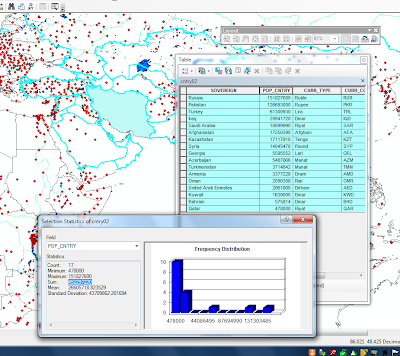
4.) There are 452,297,220, so approximately 452,300,000 people that live within countries whose territory reaches with 300 km of Iran.

To complete this I first used select by attribute to select Iran, and then I created a new layer that only consisted of Iran. I then used this new layer as a basis for selection by location. I used countries as the target layer and the new Iran layer as a source layer with a 300 km distance applied. Once the countries were selected I removed Iran from the selection (you can see this in image, the southern border of Iran is not selected) and then I used the statistics features on the POP_CNTRY Field.

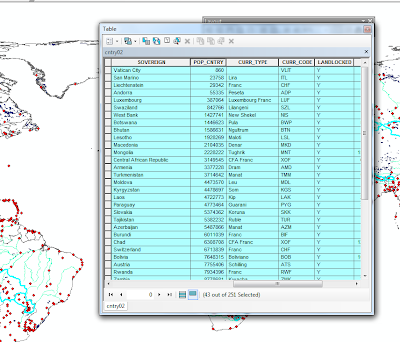
5.) The least populous landlocked country is "Vatican City" and the most populous landlocked country is "Ethiopia." ( I was not sure if Vatican city is a legitimately considered a country, if not then the least populous country is "San Marino")

I found this by using selected by attributes to select for landlocked = y, then I sorted the results by population to find the least and most populous countries.

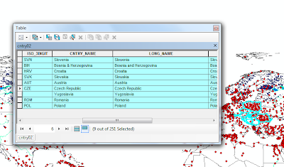
6.) There are 9 countries, not including Hungary, that are within 300 km of Veszprem, Hungary. They are listed below in the screenshot.

I found this by first selecting by attribute to get the city selected. Then I used the selection in the cities layer to do a select by location for countries within a distance of 300 km. I then removed Hungary as a result, and the countries above remained.

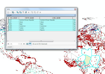
7.) There are 6 countries that border Chad: The Central African Republic, Libya, Niger, Cameroon, Sudan and Nigeria.

To get this selection I first used select by attribute to select the country of Chad. I then created a new layer so I could do a new select by location also using the country layer. I used the Chad layer source and the country layer as the target and selected by "features touch the boundary."

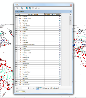
8.) Russia: 97 Cities
United States: 93 Cities
Thailand: 72 Cities
Turkey: 67 Cities
Cote d'Ivory/Poland: 50 Cities

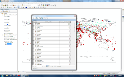
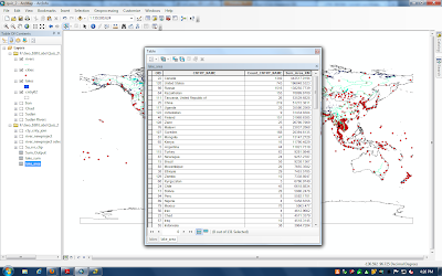
I found this by looking at the city data. I first sorted the data by country name, then I used the summarize tool to produce a table that counted how many times each country name appeared in the CNTRY_NAME column. I then sorted the results, to find the top 5 countries with the highest number of cities.

PART 2
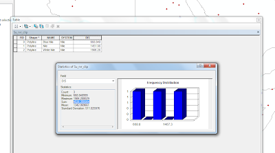
9.) The sum of the river length only in Sudan is approximately 4026 km.

I found this by first selecting the rivers that traveled through Sudan, even if they were not completely contained. Then I created a new layer from that selection and changed the projection to Africa Sinusoidal so it was projected in a distance and not decimal degrees, as this is necessary to calculate distance. Then in order to only get the length of the river that was inside Sudan, and not the whole length, I clipped the new layer using an outline of Sudan I had created. Once this was complete I added a new field in the table and calculated the length in kilometers. Then I used statistics on the column to get a summed distance.

10.) Here are the 5 countries with the greatest number of lakes:

Russia: 1516
Canada: 1340
United States: 743
China: 219
Sweden: 168

To do this I basically used the same process as in question number 8.

11.) Five countries by greatest lake area:
Canada: 443517 sq km
United States: 196848 sq km
Russia: 138250 sq km
Kazakhstan: 70899 sq km
Tanzania: 53539 sq km

To complete this I first went to the lake layer table and added a field and calculated the area of the lakes in square kilometers. I then sorted the lakes by the country they were in and used the summarize tool again, though this time I requested the tool to also summarize the "sum" of the area column based on country name. Once the resulted were generated I then sorted the "Sum_Area_KM" by what is largest.

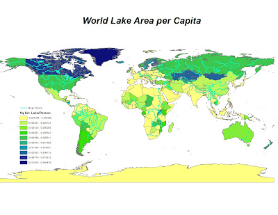
12.) To do this I took the summarized data from the question above and I joined it to the country layer. After I joined it to the layer I then used the summed lake area per country and the population per country to create a new field that was per capita lake area per person. (Lake Area in Country/People in Country.) I then used the symbology tools color code the map accordingly.


Tuesday, August 30, 2011

Lab 4: Fire Hazard Analysis


A beginning step, and possibly one of the most important steps, is to appropriately prepare the collected data for analysis. The analysis of fire hazards relies on multiple factors, two of them being the slope of land and type of vegetation coverage. Because slope is a critical factor and is based on the DEM data, it is critical that the DEM data is in appropriate units for the slope calculation. To ensure this, the first step is to change the projection of the DEM, which is originally in degrees, into a projection that uses unit distance, or in this case meters. Additionally to be safe, the FRAPS landscape coverage should be converted as well.

Following this initial preparation a hillshade and slope layer can be created. The analysis in this scenario is a product of how slope and vegetation are reclassified and then added together using map algebra. In this project I used a 10 point NFPA Hazard Points ranking system to reclassify the slope percent rise values into fire danger. This is fairly robust system as, though fire hazards are highly subject to local conditions, slope by itself is reasonably well classified. For the vegetation reclassification I created my own numerical classification also based on a 0-10 scale that while loosely based on the NFPA Hazard Point system demonstrates some challenges in accuracy. Without intimate knowledge of the local area, seasonal conditions, longitudinal trends it is difficult to create a vegetation classification system that provides relatively accurate predictions.

There are also some additional challenges in this fire hazard analysis. Even if the individual fire hazard classification for each factor has an acceptable degree of accuracy there is the issue of weighting each factor. This issue is first present in the reclassification system, because when the map algebra analysis consists of summing the values of each factor, it is possible to weight a factor by giving it a larger scale. In my analysis, I equally weighted slope and vegetation in reclassification by providing a 10 point scale for each. Additionally, it is also possible to weight each factor during the process of raster calculation by providing a multiplication coefficient, however, without a greater knowledge of which factor has greater importance, this model again only uses equal weighting. Thus, my results final results, while demonstrating a clear trend of increased fire hazard in areas of dry vegetation and greater slope, can only provide general predictability, especially as other important factors are missing and with issues of factor weighting.

Tuesday, August 23, 2011

Final Project Proposal

My final project will focus on an elementary geographic analysis of the Ethiopia’s decision to site new dams along the Blue Nile. The analysis will consist of using one dam as a test case to identify what geographic area will experience hydrological impacts, along with attempting to sum the potential affected population. I currently have a global drainage basin data set, DEMs and limited “populated places” data. I would like to find more detailed population data that I can overlay by water drainage basin. I am also looking for more detailed hydrology data or images that better help represent surface water flow and area.

To begin I will find the best approximate location for a proposed dam to correctly site the dam location with respect to hydrology data. Following that I will use basic spatial analysis to select the downstream impacted hydrologic basins and correlate these areas to the best available population data. This will provide a minimum area and population affected by a dam construction. If possible I would like to further extend this analysis using a DEM data set to explore more detailed hydrologic implications, for example, an estimate of what area will be flooded, and if possible what land type is affected and the possible social implications of this.


map source: http://danielberhane.wordpress.com/2011/07/01/leaked-map-of-ethiopias-4-new-dams-on-nile/

Monday, August 15, 2011

Quiz 1

I agree with the recent LA City Council decision that requires medical marijuana dispensaries to be at least 1,000 feet from places where children congregate. As a recent LA Times article mentions, there is growing concern over the rapid and uncontrolled expansion of the dispensaries that is angering neighborhoods. This ruling is especially as the growing initiatives to legalize marijuana, such as the recent attempt to pass Proposition 19, indicate the need to help develop the ordinances, laws and support structures to effectively and safely regulate the growing use of marijuana.

Not only is there a growing need for regulation, but as the GIS analysis in Figure 1 demonstrates, the LA City Council regulation is indeed feasible. An initial examination of the embedded image in Figure 1 demonstrates there is potentially significant overlap of the 1000 foot boundary for schools, parks and libraries. However, as Figure 1 zooms into the blown up image of the most dispensary dense area, the figure shows that while several dispensaries do overlap in the 1000 foot zone, there are many existing dispensaries that are within the new legal area, and furthermore there is ample areas that would be safe to build new dispensaries or relocate existing ones. Of the 175 dispensaries in Los Angeles Area GIS analysis shows that 46, or 26.3%, fall within the restricted, or buffer, zones.

This does present some challenges that are necessary to consider. This preliminary analysis requires over a quarter of existing dispensaries to change location, which is not only expensive, but also creates potentially unnecessary further competition with a reduced area available for operation. Additionally, for dispensaries that are mobile, or dispensaries that have delivery service, these new restrictions could make operating in Los Angeles much less profitable, especially in an already challenging economic period.

However, as a California Watch article reported last year, the move for mobile dispensaries and delivery service is in part a tactic to evade existing bans and regulations. If this is the case, then the LA City Council decision is important because it is an attempt to properly enforce existing stipulations and again bring regulation to a growing and limitedly regulation medical field. Also, as the as the embedded map shows, there is a very large number of schools, public areas, and libraries in Los Angeles and as the population grows more and more of these services will be needed. Having an ordinance such as the proposed one will allow for a consistent and expected growth of both services to the population, rather than potentially more haphazard regulation in the future.

Additionally, as the LA City Council and LAPD argue in the LA Times Article, this regulation can help restrict illegal access to marijuana. Though this may be an unrealistic goal, the regulation will at least allow for easier monitoring of facilities, as certain areas will be off limits and possibly dispensaries will become more aggregated. The GIS data already demonstrates this phenomenon as almost all of the dispensaries in Venice and Santa Monica are within a few blocks of each other. If a trend like this proceeded to occur, it would make monitoring and regulation easier for agencies and the public.

Overall, the implementation of the 1000 foot buffer zone for dispensaries is a necessary step in regulating an ever more popular substance, and as GIS analysis demonstrates, though initially costly for a minority of businesses, plenty of space exists for current and new dispensaries to continue to grow. With intelligent implementation and planning, the growth of this industry and continue successfully in a better regulated environment, that keeps local cities content and in a safer environment for youth and children.

Sources:

http://californiawatch.org/public-safety/marijuana-delivery-services-evade-bans-dispensaries-spreading-across-california

http://cityclerk.lacity.org/cps/pdf/preliminaryResults08-25-10.pdf

http://latimesblogs.latimes.com/lanow/2010/01/los-angeles-city-council-approves-pot-ordinance-requiring-1000-foot-buffer-zones.html#more

UCLA MAPSHARE